How do you get website visitors to buy a product/ sign up for subscriptions/ download free trials/ do pretty much whatever you want them to do?
If this question is too easy to answer, online entrepreneurs would no longer have to walk miles just to increase their sales each month by mere few bucks. Truth is, running a biz in the World Wide Web is one of the most daunting challenge for entrepreneurs. It may purge stress from earmarking budget in building a physical shop, but selling to netizens has never been a walk in the park.
Intricacies of the process are often spawned by the difficulty of determining what online consumers want, exactly. Fortunately, A/B (or Split) testing can elucidate these customer-related adversities.

Boost in Sales and Conversions through A/B Testing
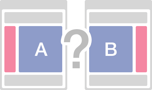
Most Internet-based businessmen are probably familiar with the concept of split testing. But for the sake of neophytes, A/B testing is a process of creating two versions of a page which will be tested for evaluation. This procedure is typically conducted to define potential design adjustments that can bring greater profits and conversion rates.
It starts with the selection of a web structure component that can be tested. This particular element will have two variations embedded in a couple of variants. The two different page layouts will be showcased to audiences who are unsuspectingly participating in the experiment.
At the end of the test, analysis will be made based on the number of clicks, sales, or visits to landing pages. Through this metrics, merchants can a gauge which components are contributing to the performance of the web page. And obviously, these will be implemented in web designing.
A/B testing can help you gain a spike both in sale conversions as it:
- Allows businessmen to have thorough understanding of their niche’s behavior, purchase motivations, and specific priorities when they navigate a website
- Assists in problem resolution related to web pages. Split testing is an effective tool in diagnosing the root cause of hitches and generating probable solutions
- Proves or nullifies assumptions and hypothesis on how a website performance can be improved. Suffice to say, A/B testing allows merchants to go through the trial and error process without wagering their reputation and profits.
The experiment can help you challenge your decision to re-create the appearance of the page. In essence, it allows you to look into the consequences and products of an action even before you plunge into it. As such, you have the power to un-do and skirt potential mistakes.
Elements for sale conversions
The components you experiment with in A/B testing actually depend on your goals. If you aim to improve your site’s performance in terms of sale conversions, you should concentrate on the following:
Product catalog
Item images are one of the major motivators of consumers in buying products. In the world of advertising, this refers to the presentation of goods before the eyes of the target buyers. In conducting Split testing, you can vary the thumbnails of the products and check which of the choices are potentially eye-catching to your niche.
Product descriptions
Most merchants place snippets of information about their products: ingredients (for supplements, medicines, etc.), brand name (for affiliate marketers), and price. This is usually the format of product description placed in the catalog.
If you want to check whether this is affecting your sale conversion, you can opt to place benefits of your offerings along with their guarantees. Lowering the prices may also dramatically spike the volume of your sales.
Call to Actions
These buttons serve as the “convincing” avenue in e-commerce site. “Buy Now!” or “Download a Free Trial” practically screams for attention and visibly tries to trigger the yearning of consumers to dip in a toe in what you have to offer. It is thus important that this component is well designed to make them most appealing and attention-grabbing.
Experiment with varying sizes, fonts, colors, and placements of your call to action and assess the most viable design to implement.
Text content
There’s a fat chance that your bounce rates and poor profits are caused by the block of text embedded in your home page. Visitors rarely find time to read superfluous articles, unless your website is crafted to be another version of Wikipedia. Filter your web content and upload only the most relevant details.

Delhi Courses Academy is a leading institute offering the best digital marketing course in Delhi, known for its practical training, affordable fees, and industry-focused curriculum. With 15+ certifications, 100% placement assistance, and hands-on projects, it prepares students for real-world challenges.

